SaaS · 2025
Task Management
Redesigning a daily-use operations tool to surface what matters, reduce friction, and turn a passive list into an active workspace.
SaaS · 2025
Redesigning a daily-use operations tool to surface what matters, reduce friction, and turn a passive list into an active workspace.
Timeline
Q1–Q2 2025
Team
Product design, engineering, QA
My Role
End-to-end product design
Platform
Web - SaaS
The task management module is a daily-use tool for operations teams managing complex, multi-entity workflows - agreements, orders, proposals - across dozens of customer accounts. I redesigned it from a flat, undifferentiated table into a prioritized, actionable workspace that lets users immediately understand what needs their attention and act on it without friction.
The existing design treated all tasks equally: identical rows, identical typography, identical visual weight. A critical overdue task looked exactly like a routine completed one. Users had to read every row to determine what mattered. The Create Task form was a bare modal with no smart defaults, no field-level guidance, and no shortcuts - adding tasks was slower than it needed to be. The result was a module people used to check boxes, not to manage work.
I led end-to-end product design - user research and problem framing, competitive analysis, wireframes and design iteration, component design for the task list and Create Task form, and final delivery of design specifications to engineering.
The redesign started with understanding how users actually worked: what did they look for first when they opened the task view? The answer was consistent - they wanted to know immediately if anything was overdue, urgent, or unassigned. The old design buried that information inside the table itself. The first design question became: how do you surface workload state at a glance before the user even starts reading individual rows?
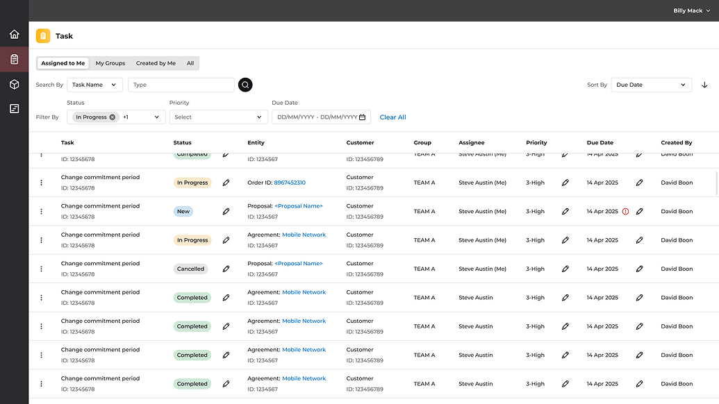
The original task list - all rows identical, no workload summary, critical items invisible.
The Create Task form had the same problem: a generic modal that treated every field as equally important. Required fields mixed with optional ones, no quick-pick shortcuts, status as a dropdown requiring users to open and read all options. Every task creation was slower than it needed to be. Redesigning it meant asking what information is actually essential at creation time versus what can be filled in later, and which interaction patterns match the decisions users are actually making.
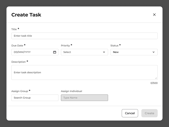
The original Create Task modal - no quick-date shortcuts, status as a dropdown, no field hierarchy.
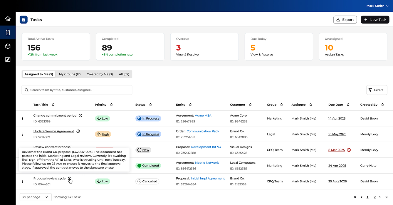
A filter lets you find what you're looking for. The summary bar tells you what you should be looking for. "Overdue: 3 - View & Resolve" is a different design paradigm than a filter dropdown set to "Overdue." One requires intent; the other creates it. Placing five KPI cards - Active Tasks, Completed, Overdue, Due Today, Unassigned - at the top of the view made the module feel like a workspace, not a database. Users oriented to those numbers first, every time.
The task list needs to be scannable - too much information per row defeats the purpose of a list view. But operations tasks carry significant context: approval stage, stakeholder notes, next steps. The hover-reveal description tooltip surfaces this content inline without requiring navigation to a detail page. Users get the context they need at the moment of decision, not after a click and page load.
The redesigned Create Task form replaced generic patterns with ones tuned to the actual workflow. Status became a segmented button (New / In Progress / Completed) - three options that benefit from visual comparison rather than sequential dropdown selection. Due date got quick-pick shortcuts (Today, Tomorrow, In 7 days) since most tasks are created for the near term. Description moved from required to optional with explanatory placeholder text. Every change reduced the gap between deciding to create a task and completing that action.
The redesigned task module opens to a workload summary - five KPI cards giving an immediate read on the state of all active work. The task list below is scannable and prioritized: color-coded priority chips, status icons, entity links that navigate directly to the related record, and hover-reveal descriptions for quick context without leaving the list. Export and "+ New Task" are prominent in the header. The Create Task form defaults to the most common patterns, reducing required input to what's actually essential at the moment of creation.
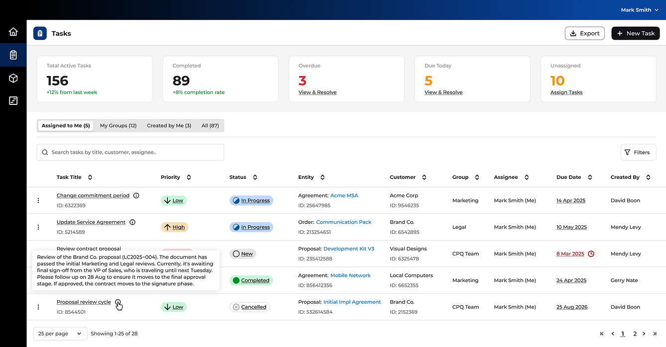
The redesigned task list - workload state visible at a glance, priority and status immediately scannable.
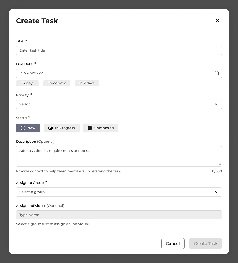
The redesigned Create Task form - segmented status selector, quick-date shortcuts, clear field hierarchy.
The redesign shifted the task module from a passive record-keeping view to an active work management tool. The summary bar became the first thing users referenced each morning - a behavioral pattern that emerged immediately in testing and carried into production use. Task creation time dropped noticeably with the introduction of quick-date shortcuts and the segmented status selector, both of which users adopted without instruction.
The hover-reveal description works well on desktop, but the interaction is invisible until discovered - users don't know contextual detail is available until they happen to hover over a row. In a next iteration, I'd explore a subtle indicator for rows with rich descriptions: a small icon, a truncated second line, or a visual cue that signals "there's more here" without cluttering the list at rest. Discoverability shouldn't require accidental discovery.