SaaS · 2025
P&L Report
Redesigning a financial reporting module to be readable, trustworthy, and useful - so sales and finance teams can validate high-stakes pricing decisions with confidence.
SaaS · 2025
Redesigning a financial reporting module to be readable, trustworthy, and useful - so sales and finance teams can validate high-stakes pricing decisions with confidence.
Timeline
Q2–Q3 2025
Team
Product design, engineering, finance stakeholders
My Role
End-to-end product design
Platform
Web - SaaS
The P&L Report is embedded in a CPQ (Configure, Price, Quote) system used by sales and finance teams to evaluate deal profitability. It calculates revenue, cost, margin, IRR, NPV, and EBIT based on configured offers and simulated pricing scenarios. I redesigned it from a dense, undifferentiated data table into a structured, version-aware financial report that users can actually read, compare, and act on.
The old design had four compounding problems. The flat, heavy table layout caused cognitive overload - every row had equal visual weight, forcing users to scan the entire page to find what mattered. Report versions were hidden in a three-dot menu, meaning users frequently didn't know they were looking at an outdated simulation. Confirmed offer data and hypothetical simulation data lived in the same undifferentiated table, with only text labels as the distinction. And there was no export functionality - teams copied data into spreadsheets manually for external sharing, introducing transcription errors and version confusion downstream.
I led end-to-end product design in close collaboration with the product manager and the finance stakeholders who used the report daily. This included mapping the existing problems through interviews, redesigning the information architecture, defining the version management model, and specifying the visual system for proposal versus simulation data separation.
The core insight from research was that users weren't using the P&L Report to learn - they were using it to validate a decision they'd already made intuitively. They needed to confirm: "Is this deal above our margin threshold? How does Simulation 2 compare to the proposal?" The old design made both questions difficult because all data existed at the same visual level, with no hierarchy and no comparison affordances. The redesign was structured around four documented user problems, each addressed with a specific design solution.
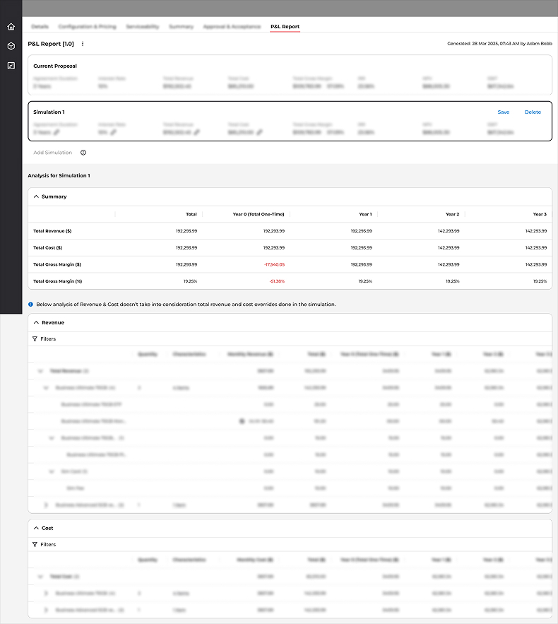
The original P&L Report - flat table, all data at equal weight, version management buried in a menu.
Version management was the most operationally risky problem. When a new simulation is generated, the previous version becomes outdated - but under the old design, nothing communicated that. Users would present numbers to customers from a stale report without realising it. The fix required making version state unavoidable: a visible dropdown showing the current version, a "Latest Generated Version" chip that disappears when you're not on the latest, and a persistent alert banner on any outdated version with a direct link to the current one.
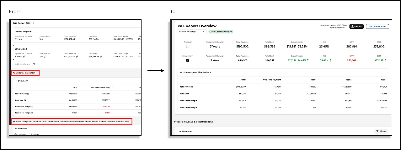
Before and after - the same data, completely different readability and decision support.
The most important numbers for a P&L decision - Total Revenue, Gross Margin, IRR, NPV, EBIT - were buried inside a 200-row table. Moving them to a prominent header bar changed the reading pattern from bottom-up scanning to top-down confirmation. Users could validate whether a deal met their thresholds at a glance before engaging with the breakdown. This also made the report shareable at a senior level without requiring the recipient to navigate the full data table.
The three-dot version menu assumed users would proactively manage versions. They didn't - and the consequences were real. The redesign replaced it with a visible dropdown showing the current version name and date, a green "Latest Generated Version" chip that signals currency, and an amber alert banner on any non-latest version: "You're viewing an outdated version of this report. The data may not reflect the latest changes. View Latest Version." Version state became a property of the report header, not a hidden menu item.
When confirmed offer data and hypothetical simulation data share the same table rows with only text labels as a guide, users can't compare scenarios with confidence. The redesign separated them structurally: the Proposal and each Simulation appear as distinct expandable sections, each with their own KPI summary and delta indicators (↑↓) showing divergence from the proposal baseline. The answer to "which numbers are real and which are hypothetical?" became a visual property of the layout, not a reading task.
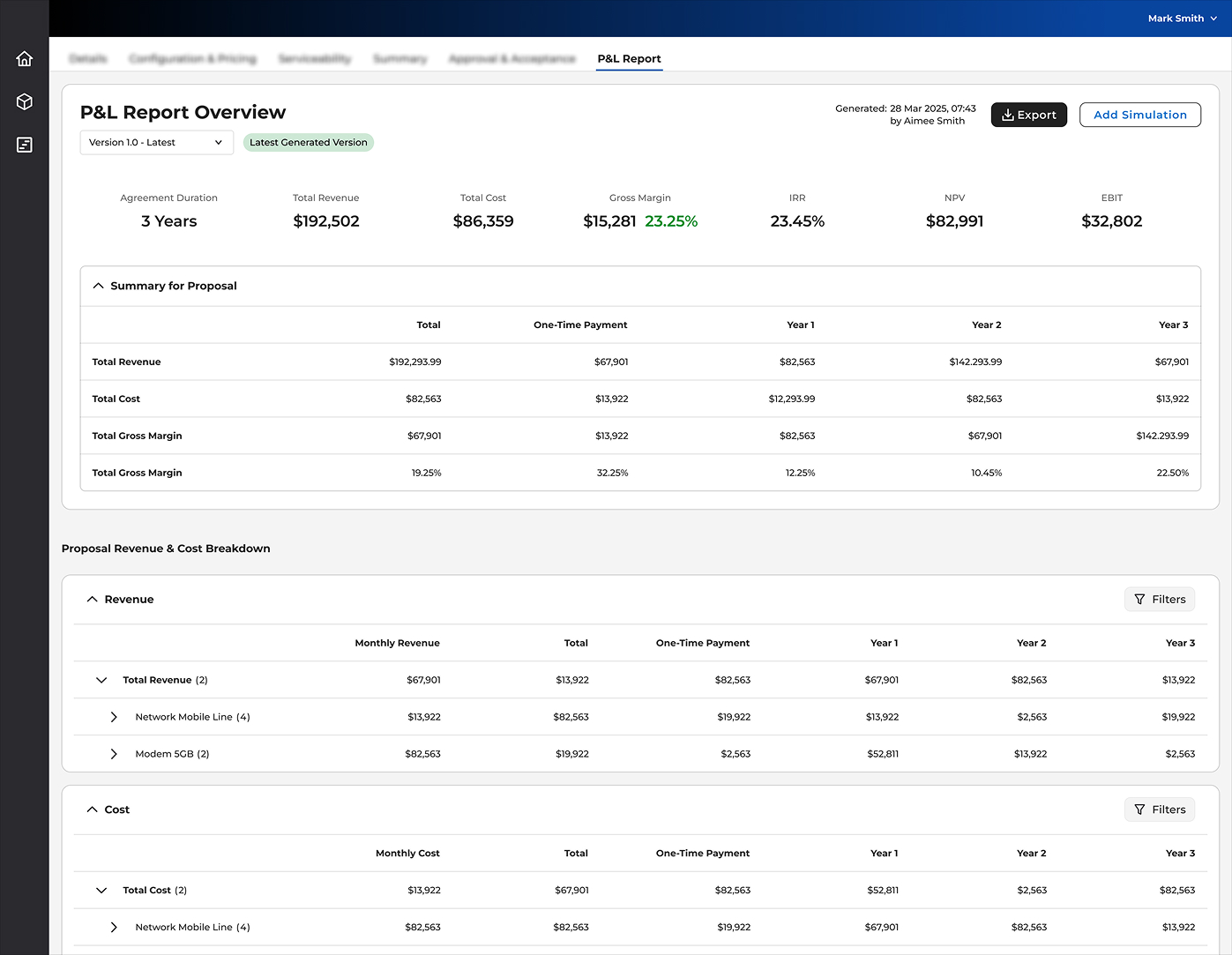
The redesigned P&L Report opens with a header bar showing seven key financial metrics - Agreement Duration, Total Revenue, Total Cost, Gross Margin, IRR, NPV, EBIT - with generation timestamp and author. Below it: a version selector with status chip, Export, and Add Simulation. The report body separates proposal and simulation data into distinct sections with year-by-year summary tables (One-Time Payment, Year 1, Year 2, Year 3) and delta indicators highlighting where simulations diverge from the baseline. Revenue and Cost breakdowns are collapsible, structured by offer group, with independent filter controls per section.
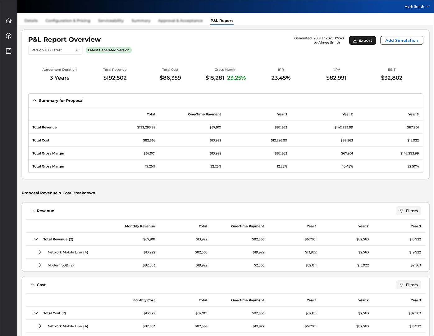
The redesigned report - key metrics visible immediately, version state explicit, proposal and simulation clearly separated.
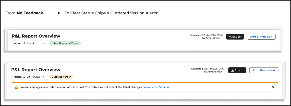
Version state made unavoidable - green chip for latest, amber alert with direct link when viewing an outdated version.
The redesign addressed all four documented user problems: cognitive load reduced through clear visual hierarchy; version confusion eliminated through explicit state management; offer and simulation ambiguity resolved through structural separation; external sharing enabled through the Export feature. Finance stakeholders cited the KPI header bar as the change with the highest daily impact - the ability to read deal health at a glance before engaging the full report changed how they used it in customer meetings.
The redesign focused on reading and comparing data - a solid foundation. The next layer is annotation and decision capture: allowing users to add notes to a simulation ("this scenario assumes a 10% discount for early renewal") so the reasoning behind financial scenarios is preserved alongside the numbers. Currently, that context lives in email threads and verbal briefings. Embedding it in the report itself would make simulations self-documenting - and significantly more useful when a deal is reviewed months later by someone who wasn't in the original conversation.